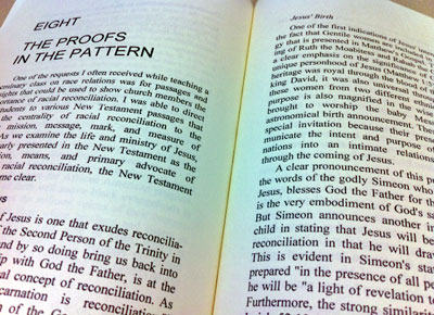
 How a book reads is an important detail that can be easily overlooked in the publishing process. But if your book’s text isn’t attractive and easy to read, then readers will be turned off before they even get into your message or story.
Too much text, small margins, and cramped lines are a few of the mistakes that are easy to make while laying out a book. But one of the most important, and subtle, details to creating a readable book is the font used for the body of the work.
When it comes to typesetting a book, you have many more choices in fonts than Times New Roman or Arial. Even better, choosing the right font for your book doesn’t have to cost you an arm and a leg––in fact, it doesn’t have to cost you anything. We’re sharing with you our favorite fonts for book copy. Some of our choices are available free from online font sites and others come standard on most computers.
For those of you who are new to typography: at the most basic level, there are two types of fonts––serif and sans-serif. Serif fonts are so named because they include “serifs,” also known unofficially as “tails,” on the ends of the letters. Times New Roman is the most common serif font.
Sans serif comes from French, for “without serif,” so these are the fonts that don’t have serifs. Arial is a standard sans serif example.
When it comes to online reading, sans serif tends to be the most legible. But in book format, serif fonts are the default for the main body text. The tails help define different letters and increase readability. Chapter headings, however, are often in sans serif fonts, which can be sleek and bold. Of course, there’s nothing wrong with choosing a strong serif font for a book title or chapter heading if it provides the look you desire.
When choosing your fonts, remember that the subject matter should dictate the look and feel of the font. If you’re writing a historical piece, go with something more old-fashioned. But if you’re writing science fiction, then you’ll likely want something futuristic. And if you’re writing a trade or business book, think about your audience and their tastes.
As you work with your publisher, designer, or yourself to help direct the font choices, remember that it’s ok to mix serif and sans serif in your book design. We often like to use sans serif chapter headings and book titles with serif body text.
Here are a few of our favorites.
Serif Fonts:
Cambria (standard)
Minion (standard)
Baskerville (standard)
Garamond (standard)
Deja Vu Serif (from fontsquirrel.com)
Goudy Bookletter 1911 (from fontsquirrel.com)
Sans Serif Fonts:
Franchise (from fontsquirrel.com)
League Gothic (from fontsquirrel.com)
Deja Vu Sans (from fontsquirrel.com)
Jockey One (from fontsquirrel.com)
Helvetica Neue (standard)
One final detail to consider when typesetting your manuscript is the line spacing. The standard amount of spacing between lines is often too cramped for a page full of text. You might want to consider adding a little extra space between lines. Your readers will thank you. Their optometrists might not.
__________
So tell us, what are your favorite fonts? When you pick up a book and look inside, what’s one thing that consistently grabs your attention? What about your major pet peeve? (Mine is when the font picked is one where the f runs into the l, like in flow. Sadly, this is a casualty of many fonts.

